
A random sample of students was chosen and each student in the sample was given an IQ test.
1. Download and open the file DescriptiveStats02.xlsx. Put your name in cell B1 of the "IQ" worksheet.
2. Generate the descriptive statistics for the IQ scores listed in column A of the worksheet.
3. Generate a grouped frequency distribution with intervals of width 10 and midpoints that are multiples of 10. Use the minimum and maximum values in the descriptive statistics to determine the midpoints of the first and last intervals respectively.
4. Format the bottom row of the table with a bottom border. In the left column below the bottom border enter the text "n =" (right-justified) and use Excel's AutoSum tool to calculate the sum of the frequencies in the right column. Make sure that the sum of the frequencies equals the number of IQ scores recorded in column A.
5. Insert a histogram illustrating the distribution of IQ scores. Is the distribution approximately normal?
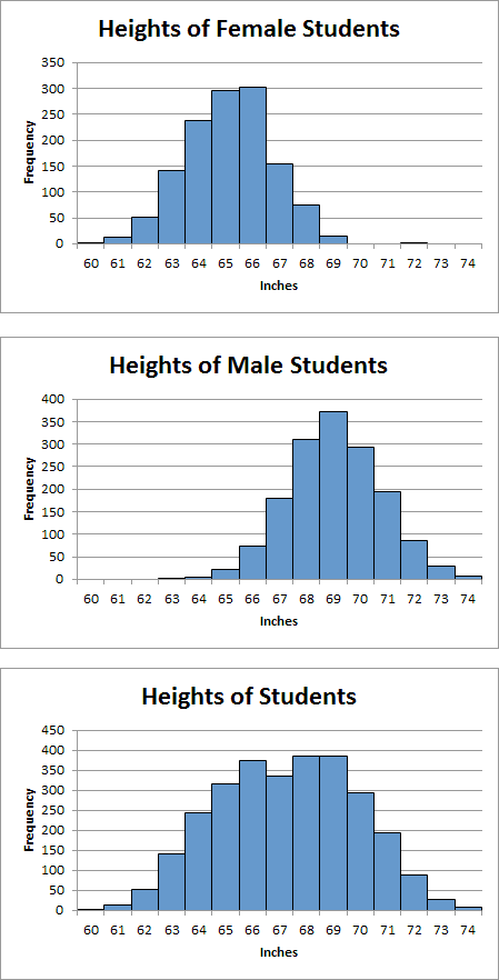
A random sample of female students was selected and the height of each female student recorded. A random sample of male students was also selected and the height of each male student recorded.
1. Go to the "Heights" worksheet and enter your name in cell B1.
2. Generate the descriptive statistics for the heights of the female students.
3. Generate the descriptive statistics for the heights of the male students.
In the steps that follow, you will generate a frequency distribution of the female heights using 1-inch intervals centered on integer heights. For example, the interval centered on 66 inches includes students with heights ranging from 65.5 inches up to but not including 66.5 inches.
4. The first value in the "Height" column should be the midpoint of the interval that contains the height of the shortest person (male or female) in both data sets. Use your descriptive statistics to determine the midpoint of the first interval. The last value in the "Height" column should be the midpoint of the interval that contains the height of the tallest person (male or female) in both data sets. Use your descriptive statistics to determine the midpoint of the last interval.
5. In the "Height" column, list the midpoints of all of the intervals from the first to the last.
6. Format the bottom row of your table to display a bottom border. In the left-most column below this bottom border enter the text "n =" and right-justify the text within the cell.
7. Calculate the number of female students in each interval in the table. (There will be no female students in some of the intervals near the bottom of the table.) Insert a histogram illustrating the distribution of the heights of female students. Is the distribution approximately normal?
8. Calculate the number of male students in each interval in the table. (There will be no male students in some of the intervals near the top of the table.) Insert a histogram illustrating the distribution of the heights of male students. Is the distribution approximately normal?
9. Calculate the number of students (combined) in each interval in the table. Insert a histogram illustrating the distribution of the heights of all students. Notice that this distribution is not normal because it has two peaks instead of one. This distribution is called a bimodal distribution.
10. Place your three charts one above the other (female, male, combined) and make them all exactly the same size. If you hold the Alt key down while adjusting the location or size of a chart, it will snap to a gridline. Your charts should look like this:
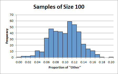
When you register to vote in the state of Kentucky, you are asked to indicate your party affiliation: Democrat, Republican, or Other. Suppose 10% of the eligible voters in Kentucky checked the "Other" box. Now suppose you took a random sample of 100 voters. What percentage of those 100 voters would be registered as "Other"? We would expect the percentage to be near 10% but we wouldn't necessarily expect it to be exactly 10%. We might get 8% or maybe 11% but we certainly wouldn't expect to get 70%.
Now suppose you took not just one random sample but hundreds of random samples of size 100. What would the distribution of the sample proportions look like? Let's find out.
1. Go to the "Other" worksheet and put your name in cell B1.
The data in column A represents the results of selecting 440 random samples of size 100 and recording the proportion of voters who checked the "Other" box on their voter registration cards. (The proportion is simply the percentage expressed in decimal form.)
2. Calculate the summary statistics for this data in column E of the worksheet. Notice that both measures of central tendency (the median and the mean) have a value of 0.10 or 10%. This is good news. While there is some variability in the sample proportions, the general tendency is that the sample results agree with the actual value of 10%.
3. Based on our five-number summary, the lowest proportion encountered among the 440 samples was 0.00 (0%) and the highest was 0.20 (20%). In the proportion column (column H) of the frequency distribution section, enter the midpoints 0.00, 0.01, 0.02, and so on up to 0.20. (This is equivalent to 0% of the sample, 1%, 2%, and so on up to 20%.)
Remember that the distance between midpoints is also the width of each interval. In this case, the intervals are of width 0.01. Half of 0.01 is 0.005. Consequently, each interval extends from the midpoint minus 0.005 up to but not including the midpoint plus 0.005.
4. In cell I6, enter the formula needed to count the number of sample proportions in the first interval. Copy your formula down the column. Use the AutoSum tool to confirm that the sum of the frequencies is 440 (the number of samples).
5. Generate a histogram illustrating the distribution of proportions for samples of size 100. Your chart should look like this:
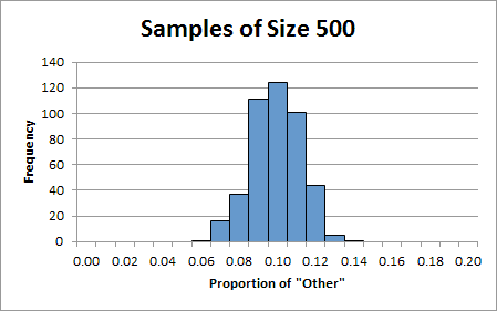
Now let's perform the same analysis for 440 samples of size 500. It is reasonable to assume that, in some sense, larger samples should be more accurate. Let's see what that means.
6. In column F find the summary statistics for the data in column B.
Notice, again, that the measures of central tendency are both near 0.10. For both small samples and medium-sized samples, the measures of central tendency agree with the actual value of 0.10. However, the standard deviations are quite different. For samples of size 100, the standard deviation was 0.032. For the larger samples, the standard deviation was much lower at 0.0129. Recalling that the standard deviation is a measure of dispersion, we see that for larger samples, the distribution is less spread out than for smaller samples. That means that the sample results, in general, are closer to the actual value or, put another way, they are more accurate.
7. In cell J6, enter the formula needed to count the number of sample proportions (for samples of size 500) in the first interval. Copy your formula down the column. You should find that there several intervals at the top of the distribution and several at the bottom that have frequencies of zero. Use the AutoSum tool to confirm that the sum of the frequencies is 440 (the number of samples).
8. Generate a histogram illustrating the distribution of proportions for samples of size 500. Normally, we would not include intervals at the beginning or at the end in which the frequency is zero, but this time go ahead and include them. Your chart should look like this:
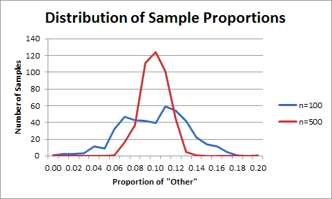
9. In order to make it easier to interpret our two graphs, place them directly above each other and exactly the same size. (Put the chart for samples of size 100 on the top.) Format the vertical scale of both charts to have the same maximum value of 140. Your charts should look like this:
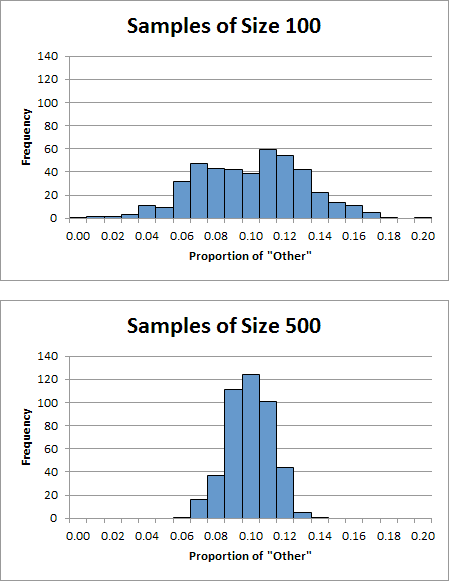
Notice that the distribution of proportions for samples of size 100 is quite spread out and has a rather indistinct peak. On the other hand, the distribution of proportions for samples of size 500 is much narrower and has a much sharper peak. These observations suggest a general trend. As the sample size increases, the distribution of sample proportions gets narrower with a taller, sharper peak (always centered on the actual population proportion). In short, larger samples tend to give you more accurate results.
10. Use frequency polygons to illustrate the distributions of both sets of sample proportions on the same chart. In Excel, select both columns of frequencies including the column headings (which will be used to make the legend) and then insert a line chart. When you are done, your chart should look like this:
A group of MAT 120 students were asked to write down their ages in months. The results are listed on the "Ages" worksheet. Enter your name in cell B1.
1. Calculate the descriptive statistics.
2. Create a frequency distribution using intervals of width 8. The mid-point of the first interval should be 208.
3. Insert a histogram to illustrate the frequency distribution.
A group of MAT 120 students were asked to write down their ideal weights in pounds. The results are listed on the "Weights" worksheet. Enter your name in cell B1.
1. Calculate the descriptive statistics.
2. Create a frequency distribution using intervals of width 10. The mid-point of the first interval should be 100.
3. Insert a histogram to illustrate the frequency distribution.
My solutions are in the workbook DescriptiveStats02Done.xlsx.